
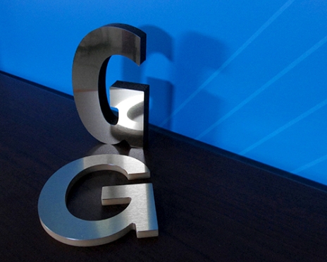
 Whether you are considering a vinyl banner, car sign, or window graphics, the size of your letters should be a key consideration. Letters that are too large can feel obnoxious; those that are too small will not have enough impact on your audience.
Letter Visibility
This chart gives you a good starting point for the purposes of designing your sign. You can also go by the rule of thumb that each inch of letter gives 10 feet of visibility for maximum impact – so a 5” letter can be read 50’ away.
Location
Where your sign will be located also tells you how far away most people will be from the sign when they see it. The farther away your audience is, the larger your letter will need to be to attract attention.
Color and Contrast
Although the letter visibility chart gives you a good starting point, a few more factors need to be considered before committing to a final design. One of these is the amount of contrast in your sign between the letters and the background. A higher contrast sign (such as black and white) is going to have better visibility that one with lower contrast (such as grey and red). If you choose a lower contrast design you may need larger letters to ensure your sign is visible from the appropriate distance.
Here are the best color combinations for contrast and readability:
- Black on yellow
- Black on white
- Yellow on black
- White on black
- Blue on white
However, also consider the environment where your sign will be located; you want the colors of your sign (specifically the background) to contrast with the surroundings. For example, if your sign was going up on a red brick wall a red background would result in your sign blending into the wall, a white or yellow background would make your sign more noticeable.
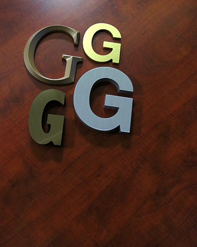 Font
Font
The type of font chosen for your design has an effect on the visibility of your sign. Thin or script fonts are more difficult to read than solid fonts with wider strokes. You can test out different fonts at home by printing them and hanging them on a wall. Typically, unless the script or thin font is associated with your brand, it would be advisable to choose a thicker font for your primary message.
With that in mind, here are the top 20 most popular fonts for signs:
1. Helvetica
2. Futura
3. Grammond
4. Bodoni
5. Frutiger
6. Trajan Bold
7. Myriad (Apple’s corporate font)
8. Minion
9. Bembo
10. Baskerville
11. Rockwell
12. Verdana
13. Franklin Gothic
14. Times New Roman
15. Gills Sans
16. Univers
17. Clarendon
18. FF Din
19. Avenir
20. Warnock Pro
Final Tip: Keep it Simple
Simple, well designed signs have the most impact. Try to keep your message straightforward, don’t try to cram too much information into your sign, you want to attract attention and encourage people to take the next step, whether it’s to call, check out your website, or come in for a visit. When in doubt, seek the services of a professional graphic designer for tips and advice.
Related Products


