
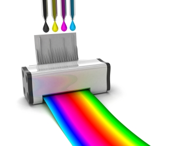
Photo credit: Danilo Rizzuti
Black is black, isn’t it? Actually, there are many different types of black – warm, cool, etc. When you’re designing with black you want to ensure that you are using the “right” combination of inks to create at true black, as well as ensuring that your graphic or design is easily read.
Why isn’t Black just Black?
When you are looking at a screen your computer uses a combination of light, including red, green, and blue to create a full spectrum of colors. When you print the printer is using cyan, yellow, magenta, and black to create color. If you are creating a design for print it is essential to ensure that you are using the right type of black for your signs and marketing materials by ensuring the right combination of inks.
Designing with Black in Photoshop
If you are creating a design using Photoshop you’ll need to ensure that you are using the correct black by opening up the color picker and looking at the default entry for black, which probably looks something like this:
Cyan – 75%
Magenta – 68%
Yellow – 67%
Black – 90%
There are few issues that this setting for black can create, such as:
Importing into Illustrator / InDesign
When you’ve create something in Photoshop, like an image, using your regular black setting and you import or place it in Illustrator or InDesign and place it on a black background. Everything’s great, right? Depending on the amount of black and placement against a black background you might have a problem, here’s why:
| Photoshop Black | Illustrator / InDesign Black | |
| Cyan | 75% | 0% |
| Magenta | 68% | 0% |
| Yellow | 67% | 0% |
| Black | 90% | 100% |
100%
The settings for black in Photoshop and Illustrator / InDesign are different, so when you go to print you’ll end up with different results. Sometimes you may not notice this issue, but the last think you want is to print off 10,000 copies of something where the black text and graphics look “off.” You’re better off to ensure that your blacks match by changing your Photoshop settings before importing into another program.
Overinking Problems
When you combine the default CMYK values in Photoshop (C 75% + M 68% + Y 67% + 90%) you get 300% ink coverage. This is too much ink for standard printing purposes; the maximum value you want is 280%. Exceeding this amount causes overinking, which can lead to blurring or smudging when you print – particularly with items that need to be crisp, including fine lines.
Fuzzy Text
When you are working with finer items, such as smaller text or anything with thin lines (including serifs), you’ll find that using the wrong combination of colors may give you fuzzy areas. Primarily this is due to the overlay of the four colors overtop of each other – if not perfectly lined up it ends up creating a fuzzy effect.
By choosing 100% black and no other colors you can ensure that your design is crisp and clean as there will only be a single application of ink to the paper.
When 100% Black is Not Enough
Using 100% black is appropriate for text where thin, crisp lines are needed, but for large areas 100% black can be a bit flat and boring, particularly if you are using uncoated paper for your final design. In these cases your design can be improved by adding a small tint of color to either create warmth or coolness, depending on what your design would work best with. Warm or cool blacks should only be used in large blocks of black or display text, where you won’t run into blurring issues.
Creating Rich Cool Black
Mixing 40% Cyan with 100% Black helps to create a rich, cool black color that can improve your design when large amounts of black are use. If you want a cooler color you can bump the Cyan up to 60%.
Creating Rich Warm Black
When you want to create a warmer black, add 40% Magenta instead of Cyan, along with 100% Black. For a warmer black you can bump Magenta to 60%.
Notice that in both cases the ink application is remaining under 280% - so you won’t have any overinking issues.
Registration Black
You’ll notice that Photoshop and other design programs have a setting called “registration black” – don’t use it, except for crop and registration marks. Registration black uses 100% mix of all four colors, so it’s not appropriate for regular printing.
By using the correct color of black you can ensure that your designs come out crisp, clear, and rich, so they are easily read and understood.
Leave a Comment