
How Do I Design my Trade Show Booth?
We've all seen the cluttered trade show booths with bad design included. You remember them ...but for all of the wrong reasons! Optimizing your trade show booth design and layout is extremely important to ensure your trade show budget isn't wasted. In the first few seconds that trade show attendees view your booth a decision is made and perceptions are formed. If you're asking yourself "how do I design my trade show booth?" we'll try to point you on the right direction. Lets quickly outline some core design principles that get help you boost trade show leads and improve engagement.
Design My Trade Show Booth
Graphic Backwall
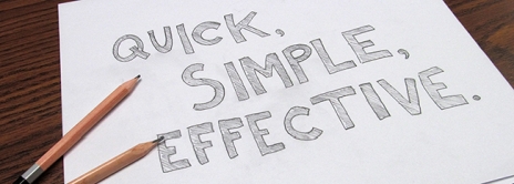
Trade show back walls have many similarities to billboards, they’re large, should have one or two eye-catching graphics and a single message that can be read from a distance. Make sure your message isn't cluttered or confused by a busy background pattern or image.
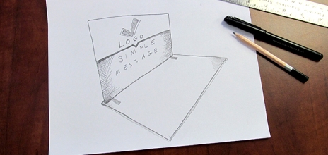
Limiting the amount of copy is also a good idea, use your logo, tagline and maybe a bullet point list....it's not a brochure!! Take a good look at who your audience or target market and develop a look and feel for your booth that caters to them.
Images
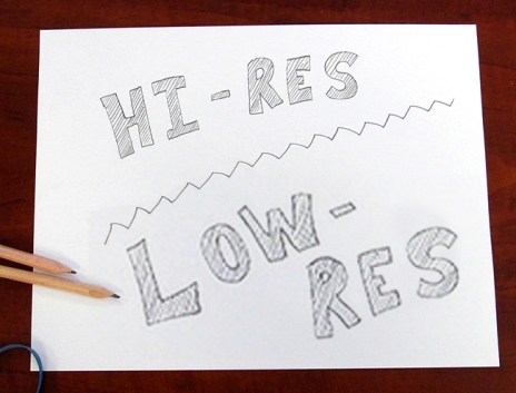
Gathering images for a large display is always a challenge. You'll want to find images that not only represent your brand well, but are also visually stimulating.
A common issue with images used in trade show displays is resolution, images spanning 10 to 20 feet need to be high resolution. Taking an image off the internet that is 3" x 4" and is 72 DPI and making it 4 feet x 5 feet will produce an incredible bad result. If you're purchasing images you'll want to buy the largest size of that image that's available.
Colours
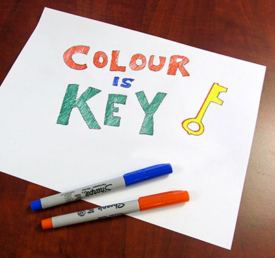
Strong and vibrant colours are a great way to introduce good contrast between images and your copy. The age, gender and culture of your target market should be taken into account when choosing a colour scheme. Colours invoke emotions good and bad, take a good look at the psychology of colour before choosing your colour theme.
Typography
Choose simple clean fonts that will be easy to read from 10’ to 20’ away and incorporate an adequate amount of white space if possible. White Space around text greatly improves readability from a distance!
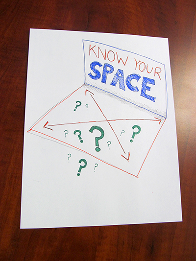
Booth Layout
It’s important to know the rules and restrictions for your assigned booth before you arrive, your exhibition organizer will have provided these details to you when you signed up for the show or will have them readily available on their website.
Overhead, a ceiling hung sign with lighting is an excellent way to draw attendees toward your booth long before they’re in front of your booth. This type of signage can be seen from a 100 feet away. Include a simple eye-catching message with your brand.
If your booth restrictions or your budget do not allow for ceiling hung signs, a header sign attached to your pop up display or back wall can be an excellent alternative. It can’t be viewed from the same distance but still provides a large clear message for those walking by.
At the front of your booth, banner stands with a bold matching colour choice provide an opportunity to present more details at close range. A literature rack can also allow a passer-by to grab your well-coordinated print materials.
Try not to clutter or overcrowd your space with props or people. Most people prefer to step into a space that’s clean and well-organized. Allow 50 or 60 square feet of sales space for a sales person, having four salespeople in a 10’ x 10’ booth is overkill and will certainly scare people away.
A well designed trade show booth staffed with professional, happy staff will provide the best opportunity for success at your next!
Related Products


Leave a Comment